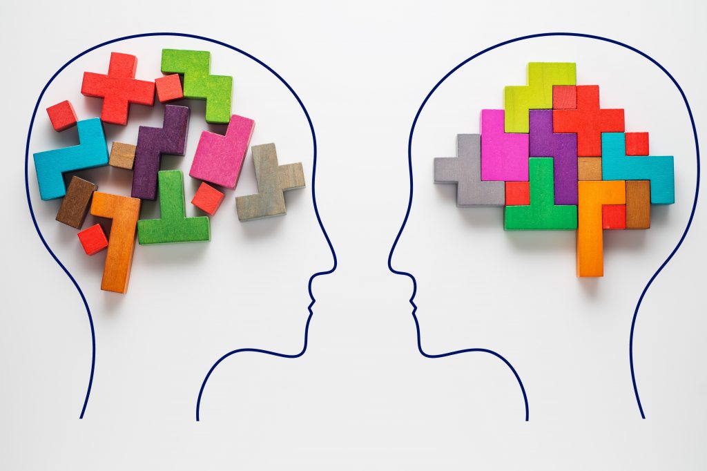
Don’t worry you’ve not stumbled into a psychology 101 class by mistake!
At Waracle, we pride ourselves on our user-centred design principles and anything that purports to be ‘user-centred’ needs to understand one thing… people.
Understanding people is difficult. But thankfully a range of smart people over the last 100 years have built, tested and communicated a range of theories, frameworks and models, that allow us (as lowly software developers) to orientate ourselves. That’s why we think designing great apps requires an understanding of psychology.
This isn’t about getting tips from Freud or re-acquainting yourself with Maslow’s hierarchy of needs. We’re talking about leveraging some key concepts from the scientific study of minds, into your enterprise apps to create exceptional experiences for the people you serve.
In the wake of COVID-19, all businesses want to become more human-centred. This requires them to acknowledge the role of human behaviour in digital products and design explicitly within that framework.
Before you leave today, we hope to arm you with a basic understanding of psychological principles in user-centred mobile apps.
OK, enough preamble. Engage your System 2 and let’s begin.
Goal-Motivated Humans
Humans are goal-motivated beings. From the great plains of antiquity to our tech-transformed landscape, one thing remains consistent. Goals, big and small, are part of our minute-by-minute lives. Since 2008, the explosion of the app store & play store has been largely built on this principle. There are 57 categories across both iOS and Android. Such apps have vastly cut down the barriers for us to achieve our explicit or implicit goals.
Whether that’s Molly, the millennial, who’d like to develop better saving habits for her first house deposit. Or John, who’s dealing with ageing health at home and needs medication reminders sent to his device… There are real people at the end of your target demographic that want to be empowered by technology.
Thus, designing digital products is about helping people achieve goals. Therefore, it requires an understanding of goal-oriented human behaviour.
But how do we build digital products that have that hook?
Products that Hook
Digital products that hook (help people achieve goals) should be a key part of your value chain.
We say hook in the sense of simple habits, rather than the more negative connotation of ‘hooked’ in the sense of being addicted!
In Nir Eyal’s book Hooked: How to Build Habit-Forming Products, he details how to build habit-forming digital products. The central argument is that turning an app feature or functionality into a habit (a behaviour that requires less conscious thought) can drive value. Whether that’s commercial or utilitarian.
His methodology focuses on a four-step Hook model::
- Triggers – external or internal cues to trigger a behaviour
- Actions – interaction with an app, linked to ease of interaction
- Variable Rewards – the motivation for using the app keeping the user engaged
- Investments – a utility generating input from the user that restarts the cycle
Once an app is effectively part of a customer’s routine, it takes considerable effort for that to change. This means you could reduce advertising spend and invest in scaling solutions without seeing attrition.
Products that hook can drive greater accessibility, data collection and speed of delivery.
But when we talk about an app that ‘hooks a user’, we are talking about ‘the what’ rather than ‘the why’. So let’s look at the concepts that underpin habitual behaviours.

4 Laws To Get Familiar With
From the work of Tverksy and Kahneman to Bloom and Ariely, the fields of cognitive psychology & behavioral economics are wide and varied, but let’s take a look at four insights and relate them to a digital example to illustrate their potency of efficacy.
Hick’s Law
Psychological Insight:
Hick’s Law, uncovered a relationship between the number of stimuli and an individual’s reaction time to any given stimulus. Experiments showed that decision making time tends to increase with the number and the complexity of the choices available.
You’ll know this feeling when you are presented with a choice of three wines on a wine list or a 200 string list from the wine cellar. More choice creates inertia and in some cases can prevent action.
How It’s Used in Digital:
One of the classic examples of this law in action is Google’s homepage.
This user experience is perhaps one of the most simple and goal-orientated in existence. It presents one clear option intrinsically linked to the user’s intention (or goal).
There is no doubt about what is required of the user, you have to enter a query, then you have two choices… search or ‘i’m feeling lucky’.
For other brands, simplifying to this level could introduce too much abstraction. The key is to monitor data, insights, and user feedback to reduce the cognitive load wherever possible in the app. Data show a maximum of 3 choice items is usually a good place to start.
That is why you see many mobile apps use multiple choice boxes, simple lists and truncated action oriented options.
The Doherty Threshold
Psychological Insight:
The Doherty Threshold, developed by Walter J. Doherty and Thadani in 1982, found that response times should be 400 milliseconds.
How It’s Used in Digital:
Laggy digital experiences don’t encourage us to come back. This near 40 year old research still provides a benchmark, four decades on. When a human’s command is executed and returns an answer in under 400 ms, it exceeds the Doherty threshold. Such experiences are considered “addicting” to users.
Think about a traditional web experience on mobile versus a PWA, Twitter’s progressive web app (PWA) decreased load speeds by 30%, which in turn increased pages per session by 65% and decreased bounce rate by 20%.
The quicker, the stickier.
The Law of similarity
Psychological Insight:
The Law of Similarity came from Gestalt school of psychology, and it acknowledges that humans make sense of things by seeing the whole rather than the sum of individual parts.
This has incredible utility in app design. As the human eye tends to perceive similar elements in a complex design as a complete picture or group, even if those elements are not explicitly joined together.
How It’s Used in Digital:
This law opens up a lot of possibilities in your app design. Similar colours, shapes and sizes can be perceived by users as belonging together or sharing a common meaning. Such visual hierarchies which allow for smooth user journeys through the app, reducing the need for customer support.
This can be seen in mobile applications where shapes infer different content types, features or types of engagement, usually linked to brand colour sets which allow a user to group functionality without actively engaging their system 2 (i.e. having to engage in deliberate mental action).
The Peak End Rule
Psychological Insight:
The Peak End Rule holds that we judge experiences mainly due to how they felt at the peak and end, rather than the sum or average of each moment.
How It’s Used in Digital:
Consider your app and where you might surprise or delight your customer, then pay close attention to where customers might exit, check out or engage in longer than usual tasks, which have a mid-point.
Optimising to these aspects first, will improve your chances of hooking your audience.
Duolingo, an app to learn a new language, often adds colourful and encouraging moments mid-way through the experience to improve retention. Then subsequently rewards you with congratulations at the end of each module.
Even if we find a task boring, scary or nerve wracking, we can feel great comfort in being visually reminded or congratulated on getting through to the end.
Ethical Design and Dark Patterns
So you’ve got the inside track. Psychology is infused into every digital experience you have. But, maybe you feel manipulated, or worse maybe it raises some questions on its ethical use.
What if businesses aren’t just adding utility through an understanding of psychology? What if brands can also surreptitiously add value for themselves underhandedly?
Well, it can happen and it needs to be reviewed on a case by case basis and reflected upon to really understand end-user value. If the people using your app or digital product feel tricked then the negative brand impact will be huge.
Some examples, which sit firmly in this dubious space, are the Roach Motel, whereby a premium subscription is easy to get into but extremely hard to get out of… or Misdirection, whereby your attention is deliberately misguided in a flow, like when you book a plane ticket and don’t realise you’ve opted in for choosing your seats at an extra cost.
Unfortunately, big brands have used these tactics in the past. However, this is a short term gain with detrimental long-term consequences. Advocacy groups raising awareness of underhand tactics are doing great work in this space to uphold standards.
Ensure you speak to your mobile partner and make sure they aren’t leveraging any of these psychological hacks in your app!

Is Technology Changing the Way We Behave?
So that’s a whistle-stop tour through just how ingrained psychology is in mobile apps and customer experience, which prompts a closing question:
As technology proliferates further into all aspects of our life, is it changing our behaviours?
The short answer is yes…and the news headlines also suggest it’s for the worst. Many can attest to the autoplay feature on Netflix eroding many a productive Sunday or the increased social comparison generated through ‘likes’ and maintaining digital avatars.
However, we’ve also seen a lot of positive change. Especially in the industries that Waracle operates in. For instance, we’ve been working with Virgin Money to empower financial literacy within their customer base. We’ve also developed life science apps that can improve Tuberculosis diagnosis across the world.
So don’t be a-freud (eye roll emoji) to open conversations with your app developer about the importance of ethical use of psychological rules and cues in your app design. Or better still, speak to Waracle today and leverage our key expertise.
p.s If this ignited a fire of curiosity around psychological principles in UX design check out this website to explore more!


